Timeline
2 months
Results
- Full website design & reusable components for sister products and marketing sites
About the Task
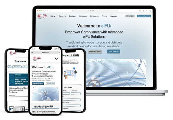
Over several months, I led the end-to-end redesign of the eifu.com marketing website — from information architecture and copywriting through to high-fidelity UI and mobile-responsive layouts. The goal was to modernize the brand’s web presence and better communicate the platform’s value to prospective customers in regulated industries.
Research
Market Research Findings
I conducted a SWOT analysis on eIFU and our competitors and identified 2 key differentiators of eIFU in the market.
Interview with eIFU Sales Director
In this conversation, I identified 3 goals for the marketing website to address.
Diversify Industries
Insight
Each of these industries has different terminology for their highly-regulated documents.
Action
This identified a big constraint — our product is trademarked as eIFU. How can we ensure visibility of our platform's versatile applications?
Credibility
Insight
Prospective clients need a risk-free way to fully understand eIFU's capabilities and ease of use.
Action
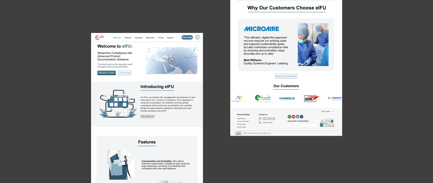
We can showcase our clientele on the website with a carousel ribbon, with links to their deployments of eIFU.
Complexity
Insight
eIFU needs to fit into the documentation workflow of companies with varying compliance needs.
Action
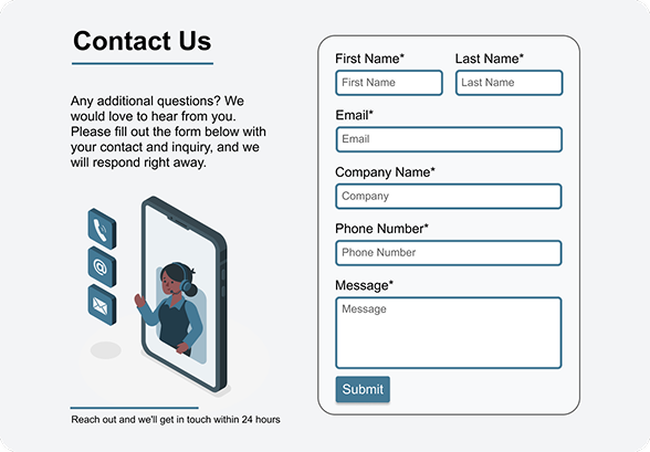
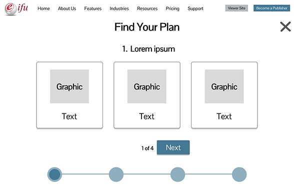
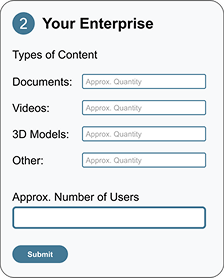
The website needs to encourage clients to reach out to our team and easily communicate key information like number of documents, organization size, and budget.
Wireframes
Utilizing components from design work native to eIFU, I was able to produce wireframes in a range of detail that allowed key stakeholders to walk-through the flow of the site and approve the project to move forward.
I also delivered designs for key components that were reused in our other marketing sites:
- Header
- Footer
- Client Ribbons
- Pricing Cards
- Contact Forms

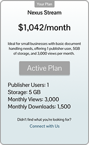
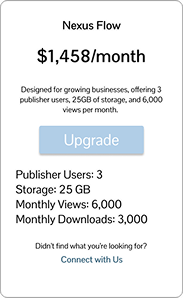
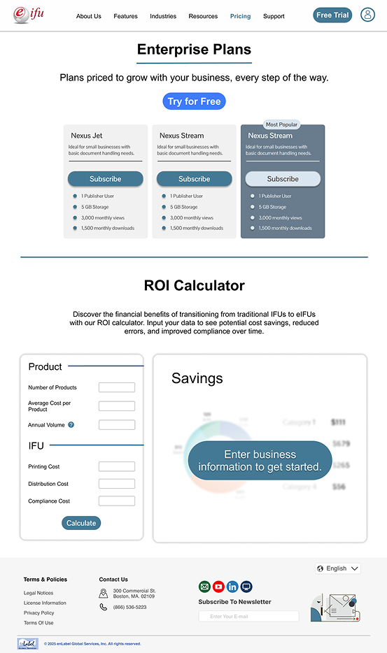
Pricing
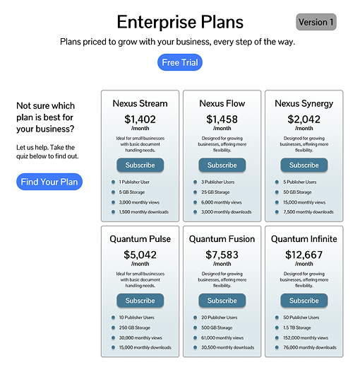
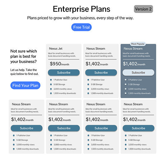
All pricing is placeholder data, with no reflection on the actual pricing of eIFU
The CEO and eIFU Business teams were key stakeholders in this project, and I presented 2 versions of pricing cards for the teams to choose from.
Version 1: Reused pricing cards from eIFU itself, using gradients and simple layouts.
Version 2: Refreshed, modern styling with configurations to emphasize certain plans for strategic business needs.
By presenting a redesign of the pricing cards, I also spurred a visual update for eIFU itself when Version 2 was the clear winner amongst the voters.
Final Frames & Responsive Designs
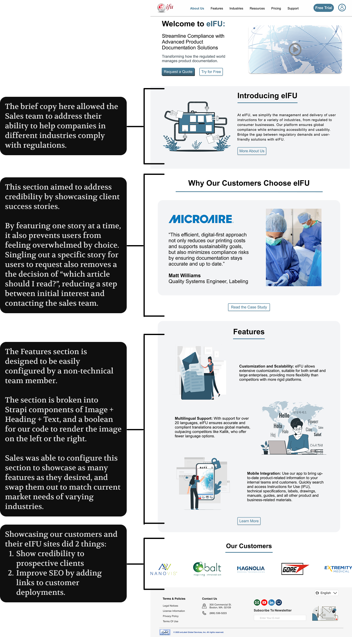
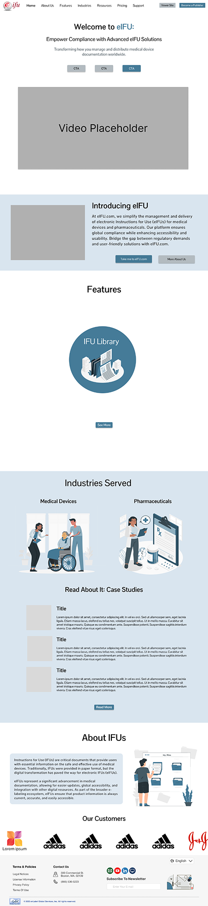
Landing Page
I aimed to address credibility and complexity with our landing page.
Using Figma autolayout, I created responsive designs that created the framework behind the CSS styling used in implementation on both eIFU, and our other products’ marketing sites.
Currently, I’ve also taken ownership of the e-Draw website, and utilize my design work to ensure cohesive layouts and styling across products.
Pricing Page
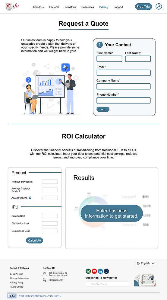
I designed multiple pricing pages to address different concerns stakeholders had. The Sales team wanted simple cards with CTAs to easily buy a plan, while the CEO wanted our eIFU plans to stay hidden from our competitors.
My first option made it easy for customers to get started with a plan, while the second prioritized validating the customer via communication by requesting a quote.
I also designed a simple ROI Calculator based off of an Excel spreadsheet from my CEO. This interactive component simplifies decision-making for the customer, allowing them to see custom benefits based on their company’s portfolio.
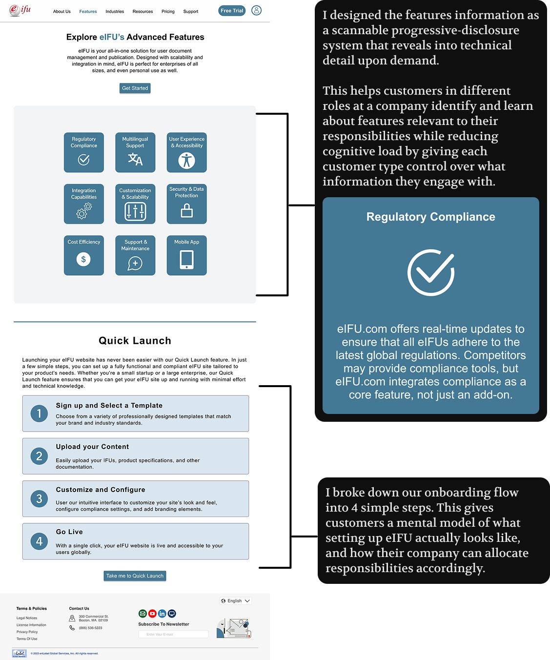
Features
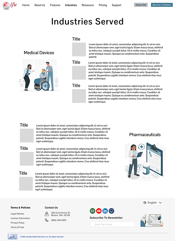
Industries
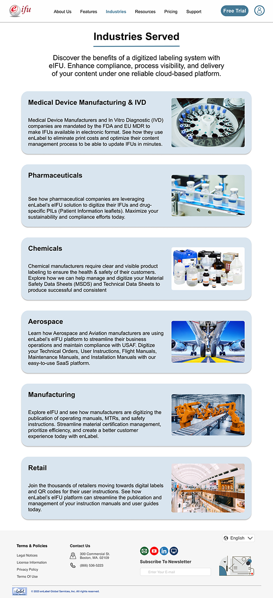
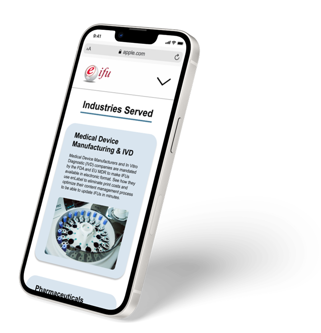
The Industries page was designed with a defined content structure prescribed by stakeholders. My contribution was the visual design and layout system, ensuring the content was presented clearly and consistently across the provided industry categories and across breakpoints.
Outcome & Reflection
This project was one of the more complex I’ve navigated professionally. Stakeholders across the company had varying priorities, and my scope shifted page to page. On constrained pages like Industries, the content and architecture were provided; my job was to present that information well, not reinvent it. Learning to deliver quality work within those boundaries without settling is something I take seriously.
The designs were not shipped in full. During a transition between internship terms, the company prioritized a faster-to-build solution. That decision was driven by development speed. As I’ve moved into a full-time Design & Engineering role, I’ve been able to bring more of the original work to life incrementally.
My background in Human Factors Engineering shaped how I approached each page — treating them as systems of information rather than visual compositions, and applying principles like cognitive load reduction, progressive disclosure, and chunking to address real friction points the sales team faced. My minor in Engineering Management helped me stay grounded in business outcomes alongside design quality.
What I carry forward most is the value of early stakeholder alignment. Good design isn’t enough on its own. Advocating for implementation means building the case for prioritization before you’re away from the table.
Since completing this project, I’ve shipped several components from this design system as reusable React components, now live across enLabel’s products and marketing sites. The system I built around this redesign is actively serving the business today, even where the full vision hasn’t launched yet. Moving forward, I’d invest in the client deployment carousel identified in research, and push for usability testing with real sales prospects to validate whether the conversion flow changes actually reduced friction in the early sales cycle.