Anonymous incident reporting designed around student trust
- 1st Place
- Mobile
- 0 to 1
Victims often avoid reporting incidents to both local authorities and their institutions due to stigma and fear. Victims who do report often do not get the justice they deserve.
What if reporting incidents could be entirely anonymous and crowd-sourced? What if communities were empowered to keep themselves safe?
said lack of anonymity kept them from reporting
of those would report if it were anonymous
said multiple anonymous reports would change where they go
Survey findings became 3 personas — and the core of our pitch.
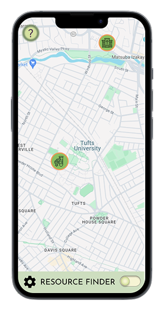
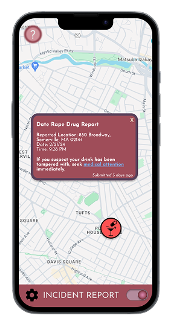
One app, two modes, one toggle
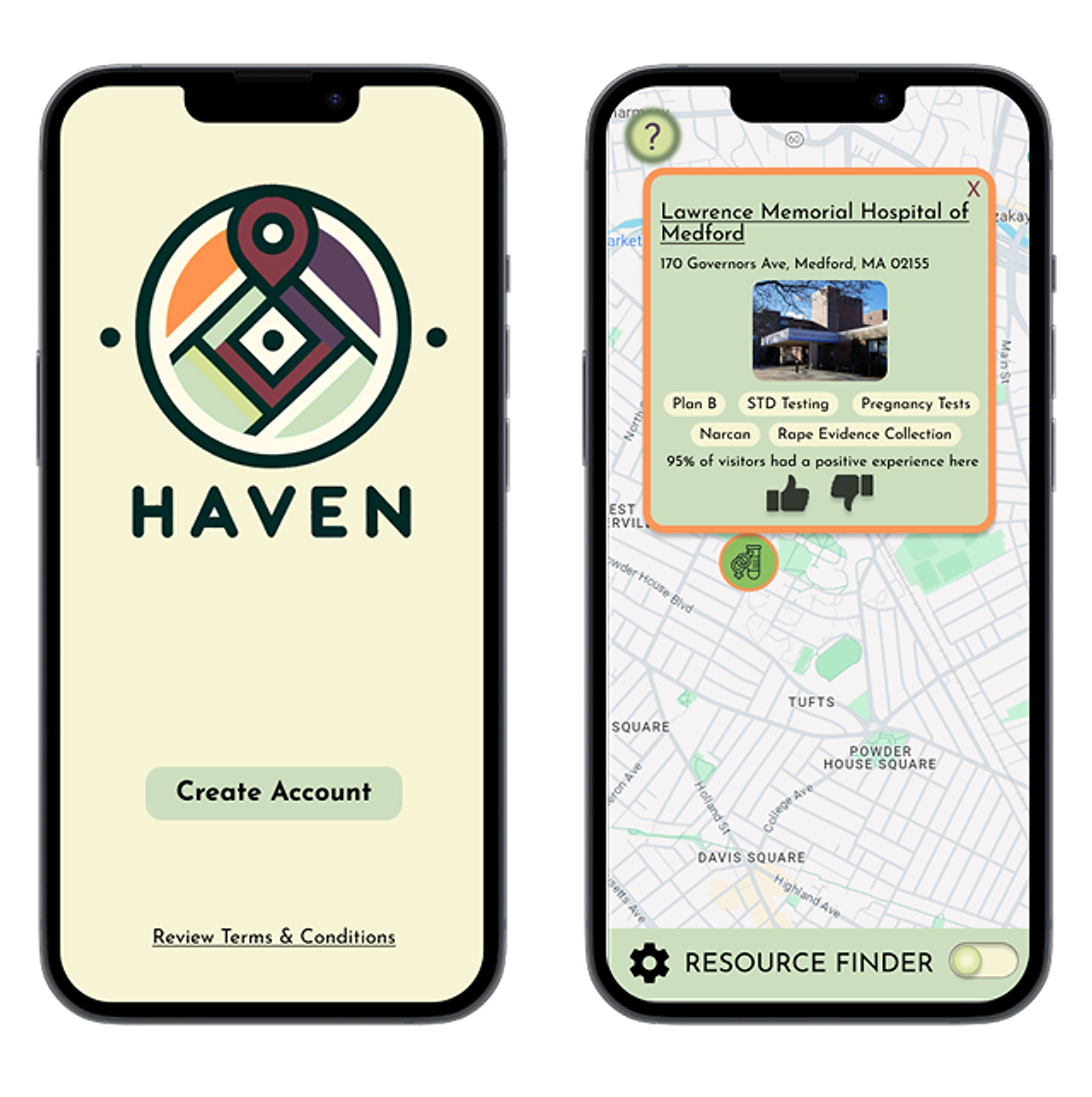
- 1 Reduce Harm — nearby clinics and services on one map
- 2 Report Harm — anonymous incidents pinned to places
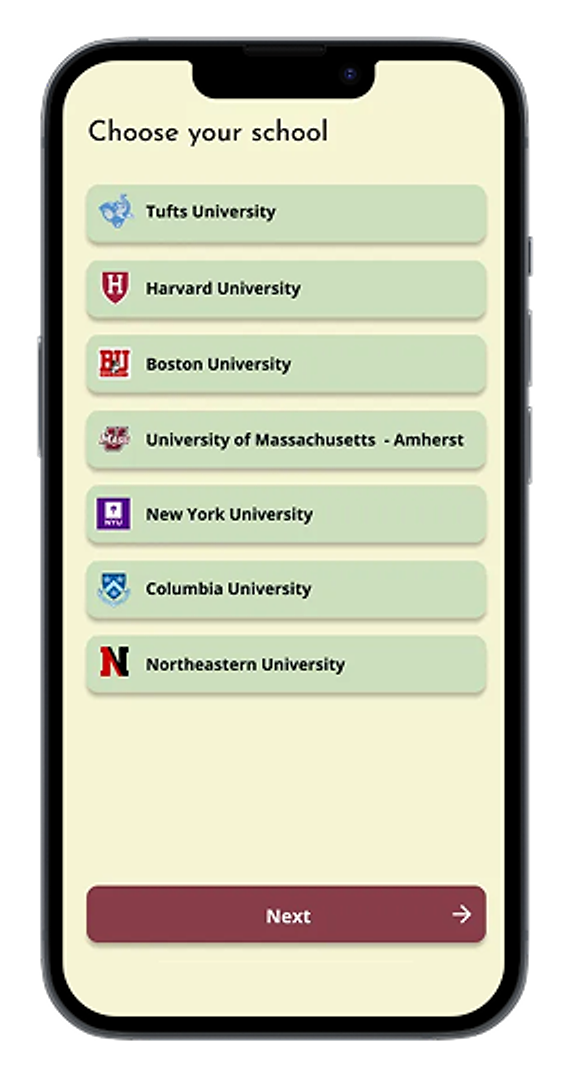
Anonymity from the first screen
Problem → fear of being identified was the #1 barrier.
Decision → verify with a university email; collect nothing identifying.
Outcome → trust is set before any sensitive content is asked for.
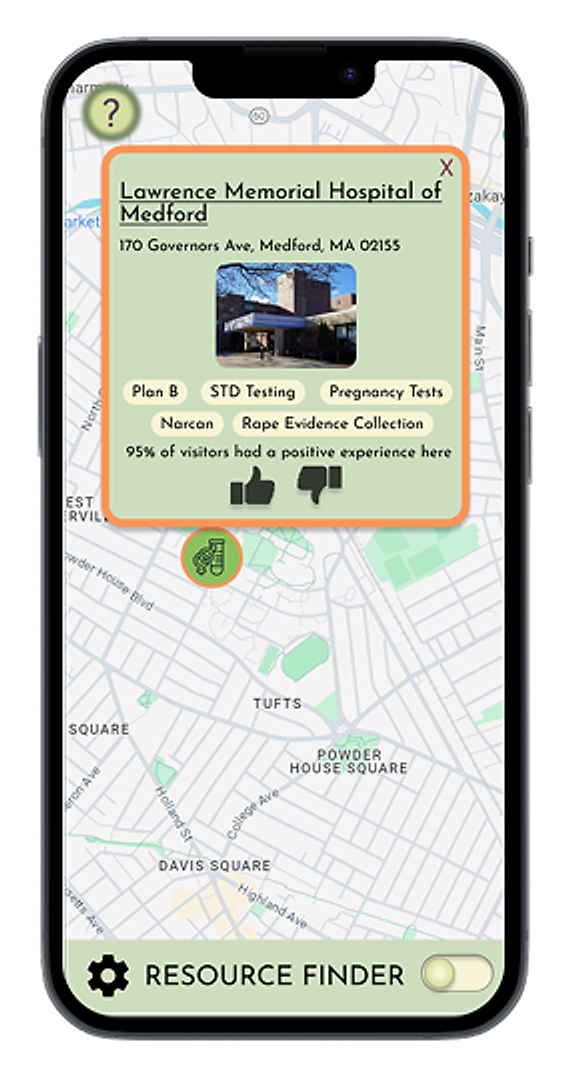
Crowdsourced trust signals
Problem → institutional directories lack peer trust.
Decision → map-based resources with crowdsourced ratings and services at a glance.
Outcome → students judge a provider's safety fast, in high-stress moments.
A color system that encodes meaning
BRAND & UI KIT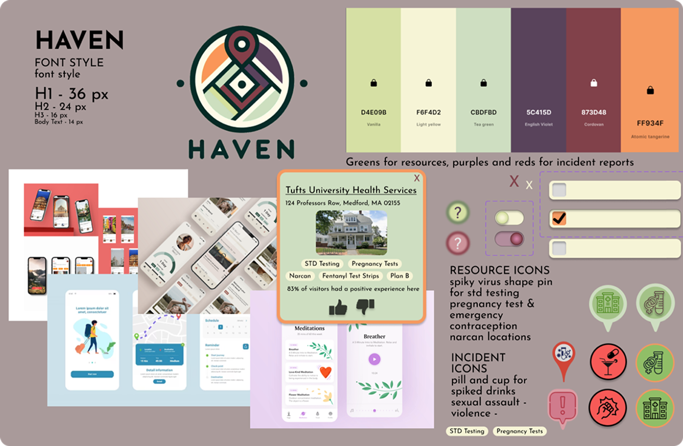
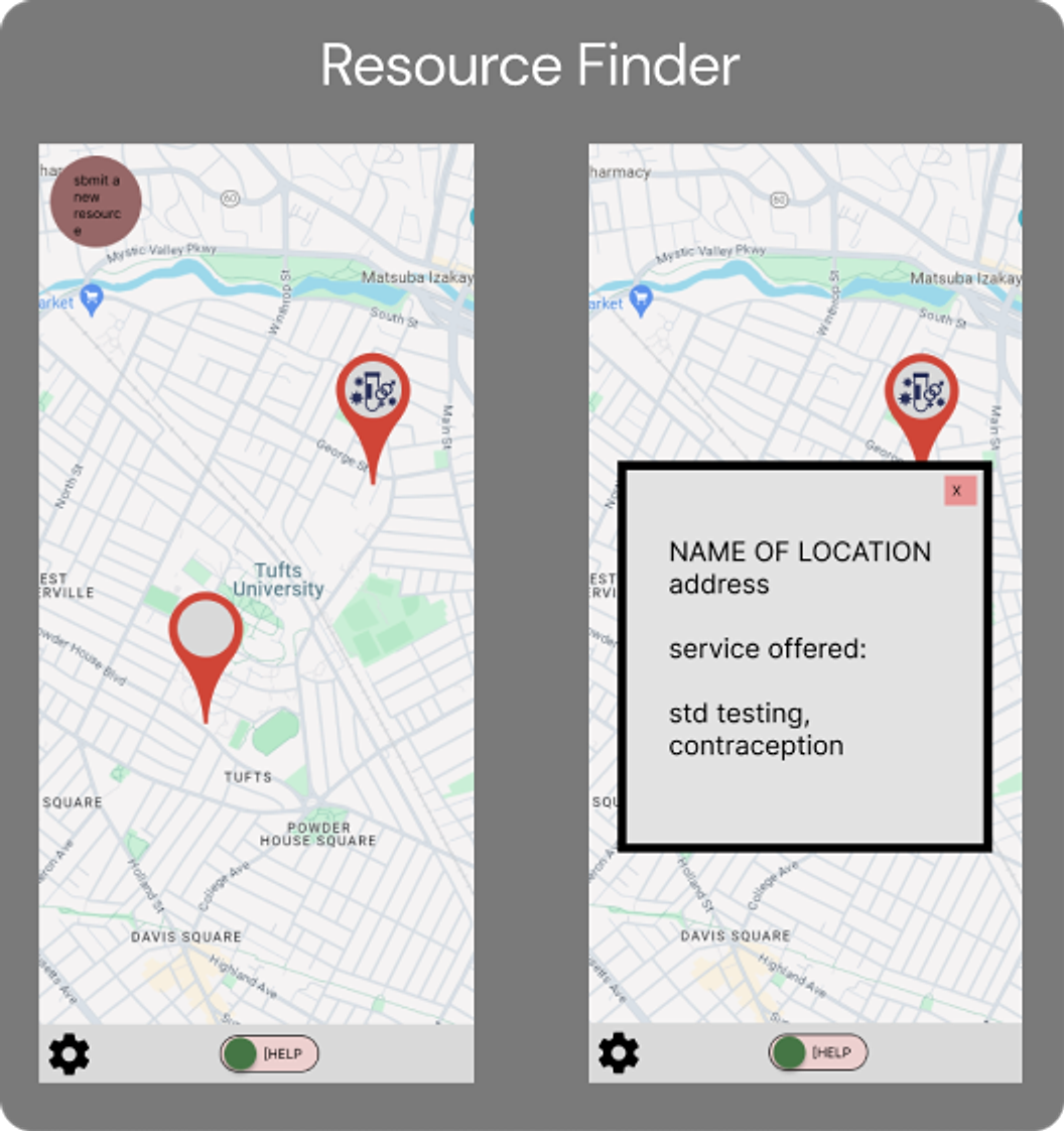 BEFORE
Wireframe
Bare map pins and a text popup; no ratings, no hierarchy.
Final MVP
Resource cards with services, crowdsourced ratings and a branded Help/Harm toggle.
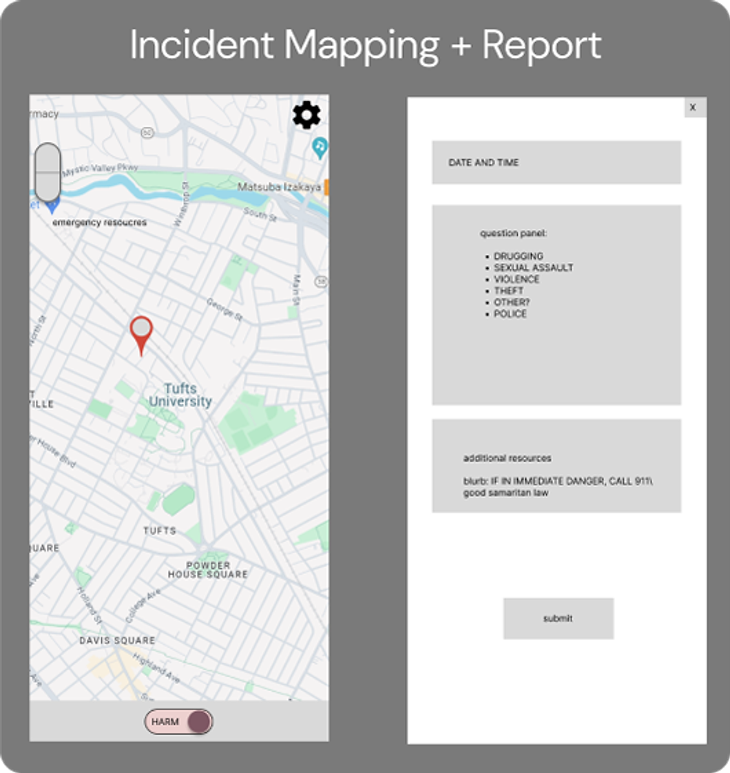 BEFORE
Wireframe
Single pin and a long gray form; no incident types on the map.
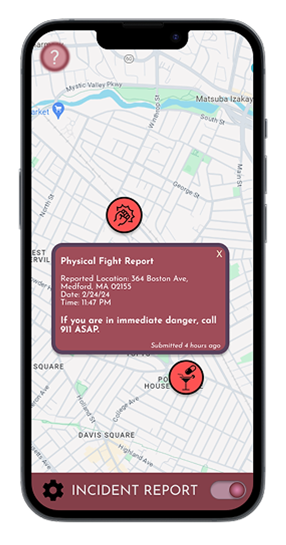
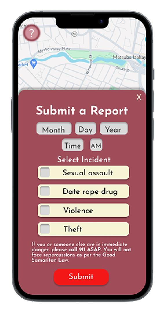
Final MVP
Color-coded incident pins with details, and a short anonymous report form with emergency resources.
- Research — survey data carried the pitch
- Design — two use cases in one calm app
- Viability — MVP prototype in 36 hours
The validation from judges on our concept showed that products aren't always about profit. I can use product design to empower communities to keep each other safe.
Next: pressure-test the anonymity model and design for false reports and misuse.